• Note: We are accepting any kind of map. However, we are specifically looking for Jigsaw Levels and Parkour maps. Therefore, your arena may have a higher chance to be accepted if it's for once of those game-modes, as long as it meets our Map Criteria.
  • We are now in Discord! Join our community discord for latest server news and more! You will also get a FREE RARE TREASURE when successfully linking your account! Join now, click here!

Skywars Un named Map - By olfern

Want it to be added?

  • Yes!!

    Votes: 6 40.0%
  • Nah!!

    Votes: 6 40.0%
  • Grek!!

    Votes: 3 20.0%

  • Total voters
    15
  • Poll closed .

pofoproud

Trusted Member
This is an 8 player map with no name yet!!
If you have any suggestions,complaints,or names please comment them.
Builder: olfern
Work Edit Majik Trikers: _Smokescreen_ and Universalz EDIT: also TheRealFishhy
Motivational Supporter: gaillardia EDIT: and TheRealFishhy

Some piks and vids:
2017-05-27_19.26.11.png


EDIT :
Special Appearances : Trenly
 
Last edited:

poise_

Member
I was obviously great with motivational support. ;)
But really, I love this map. I would love to see it added, especially right now since skywars definitely needs smaller maps like the 8 player ones.
 

EPICMATT88

Trusted Member
It looks alright on the whole; however I do not like the mix of orange blocks and acacia planks with spruce trees and the podzol. Imo I also think the map is kinda lacking something in particular, idk if it's due to lack of theme but that may be case. Anyways, I think you can make this into a good map it does need changes though.
 

pofoproud

Trusted Member
It looks alright on the whole; however I do not like the mix of orange blocks and acacia planks with spruce trees and the podzol. Imo I also think the map is kinda lacking something in particular, idk if it's due to lack of theme but that may be case. Anyways, I think you can make this into a good map it does need changes though.
It would help to know the changes ;)
 

xoSammy

Build Team Leader
Build Team Leader
It would help to know the changes ;)
I think what EPICMATT88 is trying to say (this is only a guess) is that I think the map is quite normal, anyone could think of this theme, I understand that not everyone can build it, but it's very predictable and common. To me, it doesn't exactly seem like something special. (Once again, only a guess.) :p
 
Last edited:

xoSammy

Build Team Leader
Build Team Leader
(This comment is my opinions)
Like I said above, the map doesn't seem very special as the theme is very common and predictable.

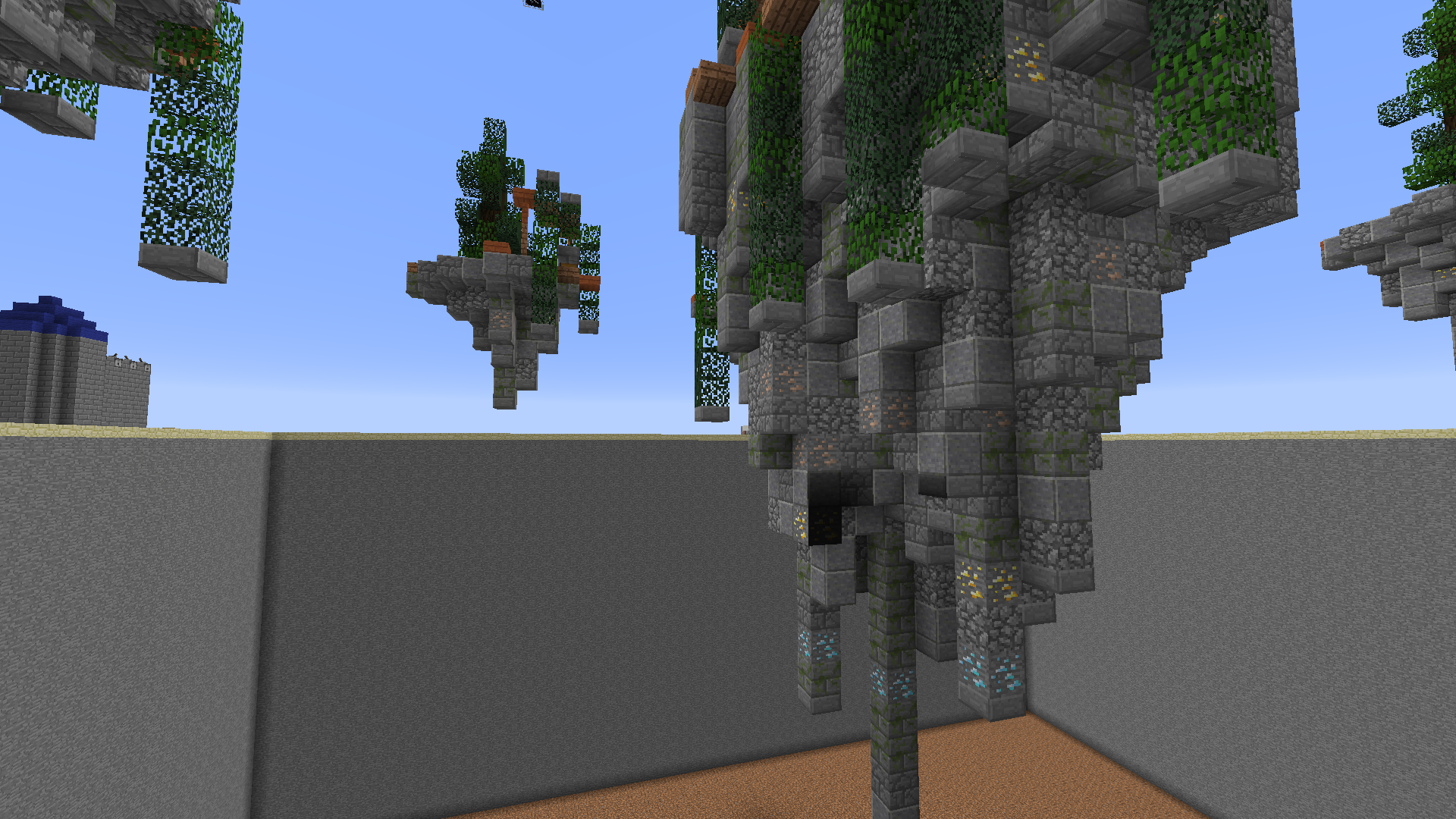
The bottom of the islands don't look that bad, the middle island looks a bit awkward underneath though. The ores under the island don't blend in much with the stone palette under the islands, maybe add in just normal stone as well? That'll help it blend.

I like the leaves that are hanging from the islands, gives it a nice 'Ruins' feeling. The trees could be a bit bigger though, they look quite small and unimportant in a way.

EPICMATT88 is right though about the acacia wood, it doesn't exactly go with the overall island palette. Maybe spruce or dark oak would be a better choice.

I think that the leaves on the outer island are quite out of place. I also don't understand why there are stone slabs on top of them as well. Maybe make the leaves a bit longer when hanging off of the island and scrap the 'bush' on the outer islands and change it to something else like a ruined stone column or something.

There are lots of improvements I've listed there (sorry if you don't understand some of them). But if this Map is denied, then I believe that those improvements would help a lot when you make a revamp of this Map (if you do make a revamp).

Once again, EPICMATT88 is right about this being a good map, it just needs some changes and improvements. :D

Good luck with the acceptance. :)

~ SamThePugMC
 

pofoproud

Trusted Member
(This comment is my opinions)
Like I said above, the map doesn't seem very special as the theme is very common and predictable.

The bottom of the islands don't look that bad, the middle island looks a bit awkward underneath though. The ores under the island don't blend in much with the stone palette under the islands, maybe add in just normal stone as well? That'll help it blend.

I like the leaves that are hanging from the islands, gives it a nice 'Ruins' feeling. The trees could be a bit bigger though, they look quite small and unimportant in a way.

EPICMATT88 is right though about the acacia wood, it doesn't exactly go with the overall island palette. Maybe spruce or dark oak would be a better choice.

I think that the leaves on the outer island are quite out of place. I also don't understand why there are stone slabs on top of them as well. Maybe make the leaves a bit longer when hanging off of the island and scrap the 'bush' on the outer islands and change it to something else like a ruined stone column or something.

There are lots of improvements I've listed there (sorry if you don't understand some of them). But if this Map is denied, then I believe that those improvements would help a lot when you make a revamp of this Map (if you do make a revamp).

Once again, EPICMATT88 is right about this being a good map, it just needs some changes and improvements. :D

Good luck with the acceptance. :)

~ SamThePugMC
I'll get to work on that once my laptop works ;)
 

iiJam

Retired HHG Build Team Leader
The map has detail, but in some areas, expecicially the spawn islands, things seem just a bit too messy. There is just too much going on and too many different blocks imo. Don't get me wrong, texture is everything in a good map. But the jungle leaves in with the spruce leaves really doesn't work together. The heads make the islands seem messy too. I also hate red stone torches used as a decorative block, even if they give moody lightin, they make a map seem really amature in mine opinion - I'm not saying this map is, I actually do like the overall look.
Compared to the first version of the map, there is a huge improvement. The orange slabs contrasted way too much with all the grey surrounding it, and the islands were all very underdetailed. Good job.
Despite the messiness, the pros outnumber the cons for me. Overall, the map does actually look quite pleasing and pretty detailed.
Congratulations, your map has been accepted.
 

xoSammy

Build Team Leader
Build Team Leader
Congrats! The improvements are lovely! (Still not sure about the bottom of the middle island) but the rest works for me! :)
 

pofoproud

Trusted Member
The map has detail, but in some areas, expecicially the spawn islands, things seem just a bit too messy. There is just too much going on and too many different blocks imo. Don't get me wrong, texture is everything in a good map. But the jungle leaves in with the spruce leaves really doesn't work together. The heads make the islands seem messy too. I also hate red stone torches used as a decorative block, even if they give moody lightin, they make a map seem really amature in mine opinion - I'm not saying this map is, I actually do like the overall look.
Compared to the first version of the map, there is a huge improvement. The orange slabs contrasted way too much with all the grey surrounding it, and the islands were all very underdetailed. Good job.
Despite the messiness, the pros outnumber the cons for me. Overall, the map does actually look quite pleasing and pretty detailed.
Congratulations, your map has been accepted.
Thank you!!! I'll make sure in future maps I don't overuse blocks ;)
 
Top