• Note: We are accepting any kind of map. However, we are specifically looking for Jigsaw Levels and Parkour maps. Therefore, your arena may have a higher chance to be accepted if it's for once of those game-modes, as long as it meets our Map Criteria.
  • We are now in Discord! Join our community discord for latest server news and more! You will also get a FREE RARE TREASURE when successfully linking your account! Join now, click here!

Declined Polluted Planet - Built By Team Technic

Status
Not open for further replies.

joexxx6

Well-Known Member
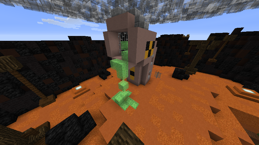
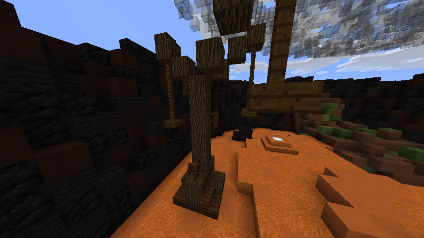
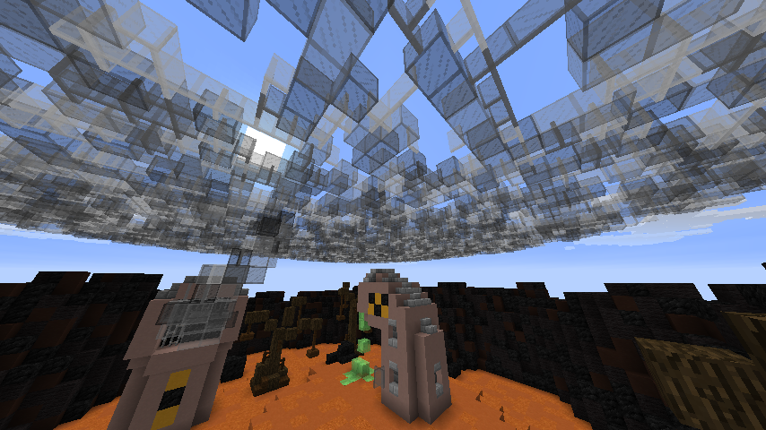
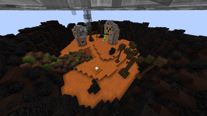
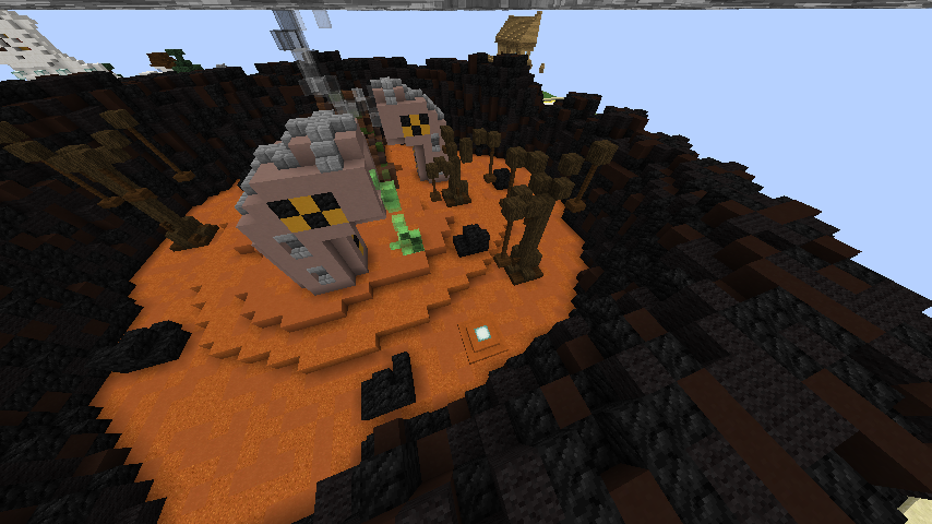
This is Team Technic's second kit pvp 1v1 map! We hope you like it! :)

Built By: Team Technic

Builders: TheSpeedyTurtle_ (Owner of Team Technic) with help from SamThePugMC (Community Builder) , OldDrunkTurtle aka. WillForPresident (HHGN Build Team Member) and BrokenGlqss (Team Technic Builder).

Found at: /p v TheSpeedyTurtle_ 2
2017-07-30_20.20.50.png
2017-07-30_20.20.58.png
2017-07-30_20.21.13.png
2017-07-30_20.21.26.png
2017-07-30_20.21.34.png
2017-07-30_20.21.44.png


-TheSpeedyTurtle_ - Owner of Team Technic
 
Last edited:

xoSammy

Build Team Leader
Build Team Leader
-=+=-
I myself think the theme is very strong and the approach of this Map has helped to show glimmers of that. I think it could've been approached at a better angle but the way this Map was executed is still good.

- I love the design of the pipes, not a typical Mario-green looking one. The smoke and the slime dripping from it really helps show this theme off.

- The trees are just wonderful, really shows off the environment as being "polluted" and dead.

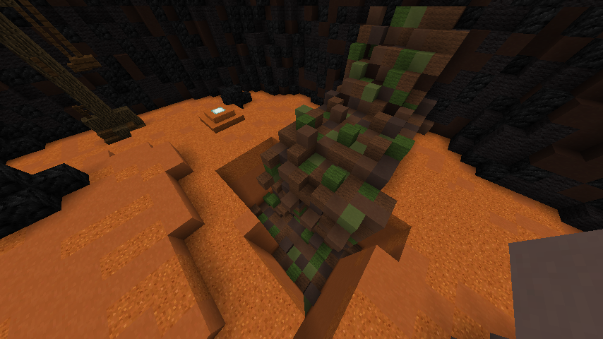
- Terraforming is nice, especially how there's a hole in the Map, something you don't usually see in a 1v1 PvP Arena.

- I'm a bit confused as to what the 2 random coal block clumps seem to be, garbage bags perhaps...?

Other than that I quite like this Map, I wish it could've been approached at a better angle but the way you've built it still works for me. :)
-=+=-
 

pofoproud

Trusted Member
ikik I'm on team technic but i didn't take part in this build so umma give my honest opinion its short but sweet ;)

i just think the pipes are ugly and the red sand doesn't match very well with the map and then the smoke coming out of that pipe forms into this flat layer of smoke i just think thats extremely weird and ugly
 

pofoproud

Trusted Member
and once again those barriers don't need to be there until the map is accepted people would like to take a good look at the map
 

xoSammy

Build Team Leader
Build Team Leader
and once again those barriers don't need to be there until the map is accepted people would like to take a good look at the map
They're better if they're there before so you can have the more "real" effect of it being a proper 1v1 Arena before it's added.
 

youngfloppa

Active Member
I like that team technic haven't gone for a grian approach(rustic) red sand and red sandstone go well together even when randomised. Now for the negative: the boarder is plain black and needs blending (blockwise) if you have access to voxel do /b bb (I could always do that in the buildteam server, if that was the only thing wrong) I hate the randomised glass "smoke" it looks like a spherical piece of glass falling down about to crush you. Give the smoke some shape, I reccomend using cobweb and using grey glass for some of the darker outsides (hope you understand what I mean [inspiration from a build called growing up]) the waste tank thingies totally need to be redone. The hole wtht the waste needs to be covered with barriers, otherwise players could abuse the hole by trapping the enemy etc.
I can't really see the brown things that I'm guessing are trees so I won't judge them. If I was trenly I would definetly decline this map, though it is a nice theme and I would like to see it be redone IF it gets declined.
 

youngfloppa

Active Member
Instead of something that looks like it was based on mars maybe make it more industrial, add some buildings in the background, make the ground more synthetic, idk, look up some concept art.
 

joexxx6

Well-Known Member
I like that team technic haven't gone for a grian approach(rustic) red sand and red sandstone go well together even when randomised. Now for the negative: the boarder is plain black and needs blending (blockwise) if you have access to voxel do /b bb (I could always do that in the buildteam server, if that was the only thing wrong) I hate the randomised glass "smoke" it looks like a spherical piece of glass falling down about to crush you. Give the smoke some shape, I reccomend using cobweb and using grey glass for some of the darker outsides (hope you understand what I mean [inspiration from a build called growing up]) the waste tank thingies totally need to be redone. The hole wtht the waste needs to be covered with barriers, otherwise players could abuse the hole by trapping the enemy etc.
I can't really see the brown things that I'm guessing are trees so I won't judge them. If I was trenly I would definetly decline this map, though it is a nice theme and I would like to see it be redone IF it gets declined.

There are already barriers blocking the hole where the junk river is falling into.
 

Trenly

Admin
Admin
While the theme is unique, the arena has its downfalls. The dead trees are cool, and while the fences/slabs give character on some of the trees they just look a bit odd. It may be that they are just too long in some spots? The terrain does have depth variation, which is nice but I would have loved to see some red sandstone slabs making the transition between levels a bit smoother in this small of a map. In a larger map the transitions would have seemed smoother due to the size of the map, although it really isn't that big of an issue with this map. One of the largest problems is the smoke. I get that you want to make it look smokey / smoggy all over, but a flat layer of glass doesn't provide that effect. It makes it look odd, and just catches the eye the wrong way. The two coal clumps also seem a bit random. I appreciate that you covered the sludge hole with barriers, but I think it could be better if you made the sludge pool a bit wider, but not as deep. It would be really fun if players could fall in there (not deep, maybe only 2-4 blocks), provided there was a way to parkour back out using the sludge river. Overall its a really strong theme, but could definitely be executed better.

Im sorry, but this map needs revision.
 

joexxx6

Well-Known Member
While the theme is unique, the arena has its downfalls. The dead trees are cool, and while the fences/slabs give character on some of the trees they just look a bit odd. It may be that they are just too long in some spots? The terrain does have depth variation, which is nice but I would have loved to see some red sandstone slabs making the transition between levels a bit smoother in this small of a map. In a larger map the transitions would have seemed smoother due to the size of the map, although it really isn't that big of an issue with this map. One of the largest problems is the smoke. I get that you want to make it look smokey / smoggy all over, but a flat layer of glass doesn't provide that effect. It makes it look odd, and just catches the eye the wrong way. The two coal clumps also seem a bit random. I appreciate that you covered the sludge hole with barriers, but I think it could be better if you made the sludge pool a bit wider, but not as deep. It would be really fun if players could fall in there (not deep, maybe only 2-4 blocks), provided there was a way to parkour back out using the sludge river. Overall its a really strong theme, but could definitely be executed better.

Im sorry, but this map needs revision.

Thanks for the feedback. We'll definitely work on the map and make all the improvements you have stated.
 

youngfloppa

Active Member
-=+=-
I myself think the theme is very strong and the approach of this Map has helped to show glimmers of that. I think it could've been approached at a better angle but the way this Map was executed is still good.

- I love the design of the pipes, not a typical Mario-green looking one. The smoke and the slime dripping from it really helps show this theme off.

- The trees are just wonderful, really shows off the environment as being "polluted" and dead.

- Terraforming is nice, especially how there's a hole in the Map, something you don't usually see in a 1v1 PvP Arena.

- I'm a bit confused as to what the 2 random coal block clumps seem to be, garbage bags perhaps...?

Other than that I quite like this Map, I wish it could've been approached at a better angle but the way you've built it still works for me. :)
-=+=-
didn't you make this map?
 

xoSammy

Build Team Leader
Build Team Leader
didn't you make this map?
I only made the pipes and one of the trees, I also made the block palettes for the floor and the border. If you actually read the rest of the post you'll see that it only says: "With help from: SamThePugMC"
 

joexxx6

Well-Known Member
Updated Screenshots:
2017-07-31_10.50.02.png
2017-07-31_10.50.11.png
2017-07-31_10.50.20.png
2017-07-31_10.50.26.png


Slabs added to make the transition of levels of smoother.
New border added and old one removed.
The hole where the Junk River falls is now 4 blocks deep, with a way to parkour out.
Tree fences shortened.
Coal Clumps removed.

We hope you like the improvements made to this map! :)
 

pofoproud

Trusted Member
i really like the improvements but theres one major flaw.. the smoke still looks really un-natural theres a narrow line of smoke leading up to this massive semi-sphere it just doesn't make since

Maybe if u made the narrow smoke that leads up the the semi-sphere gradually get thicker and also u should make the semi-sphere of smoke more thick too

You can tell that u just replaced the barriers with glass using w/e
 

joexxx6

Well-Known Member
i really like the improvements but theres one major flaw.. the smoke still looks really un-natural theres a narrow line of smoke leading up to this massive semi-sphere it just doesn't make since

Just think of it as if that is one small section of the planet and the rest is filled with pipes doing the same thing. xD

EDIT: Therefore making a whole sphere.
 

EPICMATT88

Trusted Member
I'm sorry but I don't like this map still as it stands. The toxic tubes look clunky and odd, in the updated version of the map; the small stack of smoke looks odd going up to the dome of it, and imo I would completely use a different block scheme for the ground and the hills. (I would make the ground brown colors and make the hills a dull gray) Because as of right now I think that is the biggest flaw of the map; the orange and black don't look that great together, it's a huge contrast in color and brightness. It is a good theme though and I like the trees but past that I don't think this map has what it takes at the moment.
 

joexxx6

Well-Known Member
People hated the circle of clouds so you made a dome... make proper clouds or don't have them at all.

Maybe you could give us some suggestions on what to do with the clouds and what you would like to see from them?
 

youngfloppa

Active Member
I hate the randomised glass "smoke" it looks like a spherical piece of glass falling down about to crush you. Give the smoke some shape, I reccomend using cobweb and using grey glass for some of the darker outsides (hope you understand what I mean [inspiration from a build called growing up])

TheSpeedyTurtle_ I already said it
 
Status
Not open for further replies.
Top